Boots Magazine
Design a magazine prototype completely from scratch on a subject of your choice.
Purpose: A bold, clever, and formal magazine about the artistry and culture of drag queens and kings. It is an educational tool to teach people about creative and political drag and a guide to help others start their own drag and protect the art.
Target: People of all ages, races, genders, and those who are interested in drag and LGBTQ+ issues and policies.
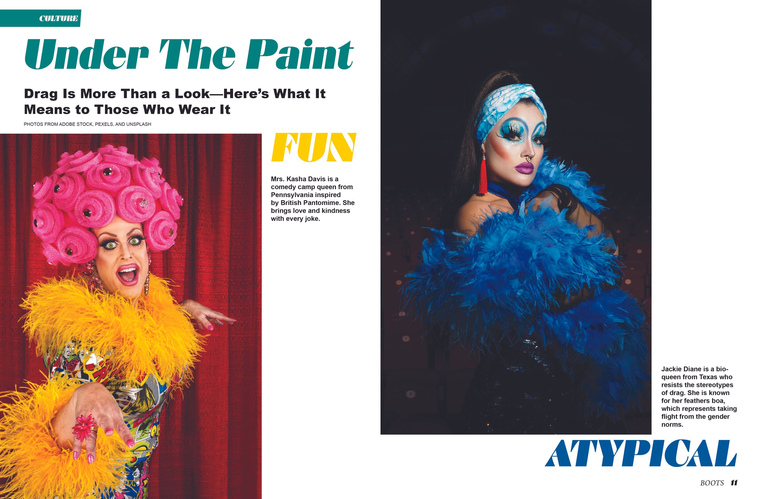
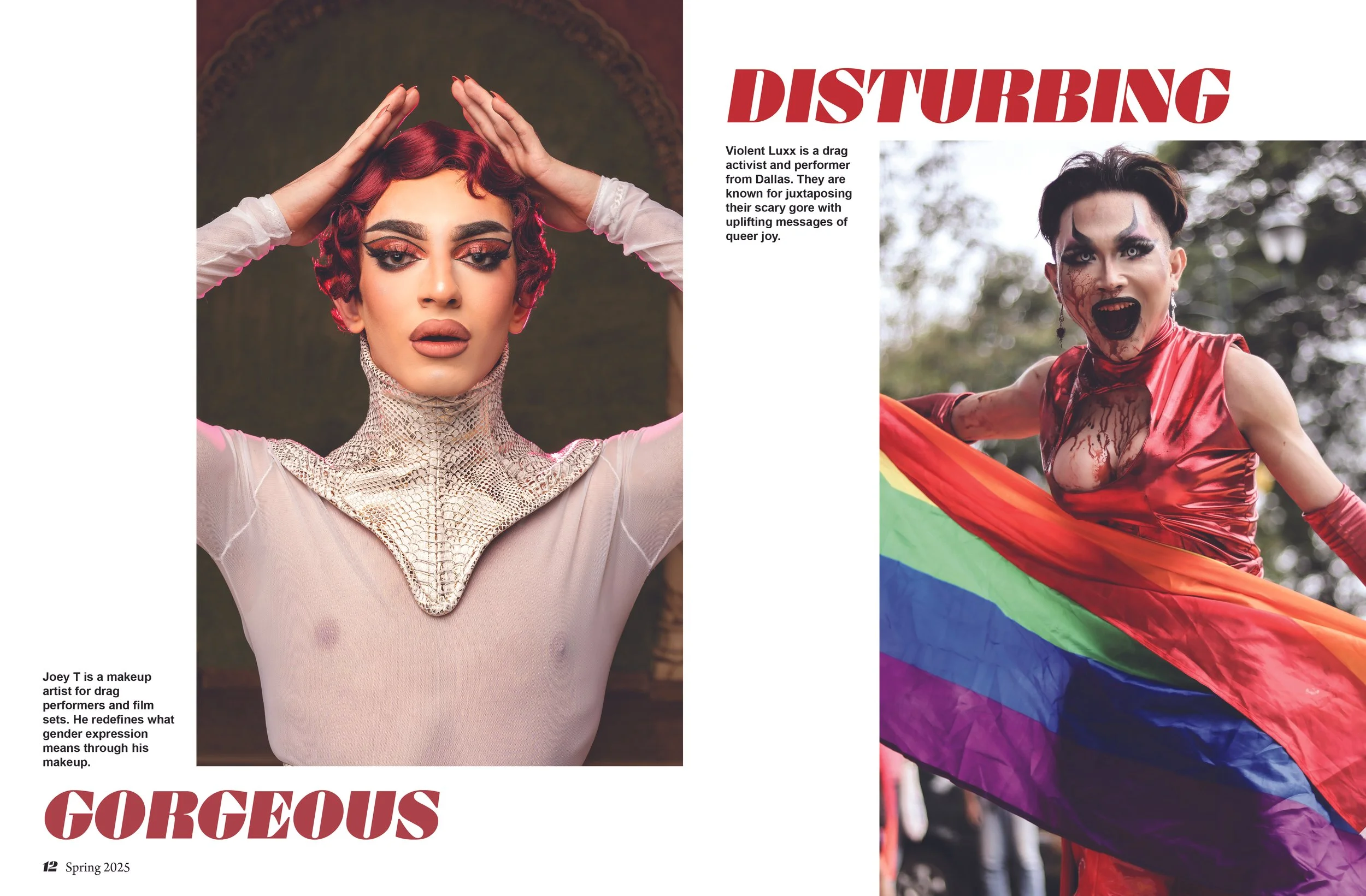
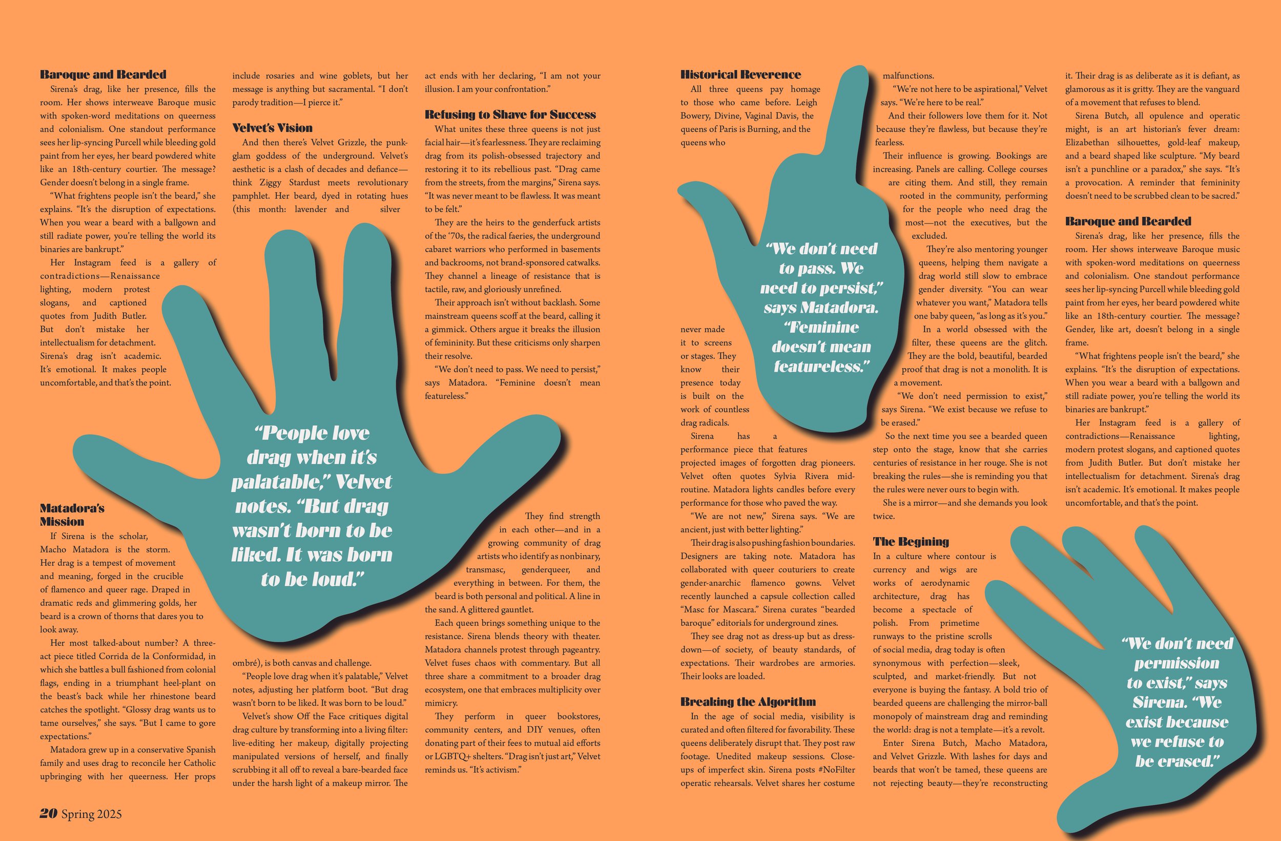
This prototype includes a cover, table of contents, section front, round-up, photo story, recurring alternate story format, cover story, and infographic. The spreads use a custom grid, typography, color, layouts, and language I created for the magazine. The images are stock from Adobe Stock, Pexels, and Unsplash, and most of the copy is AI-generated from ChatGPT.
Made on Adobe InDesign

Sometimes you have to make bad art to figure out what works.
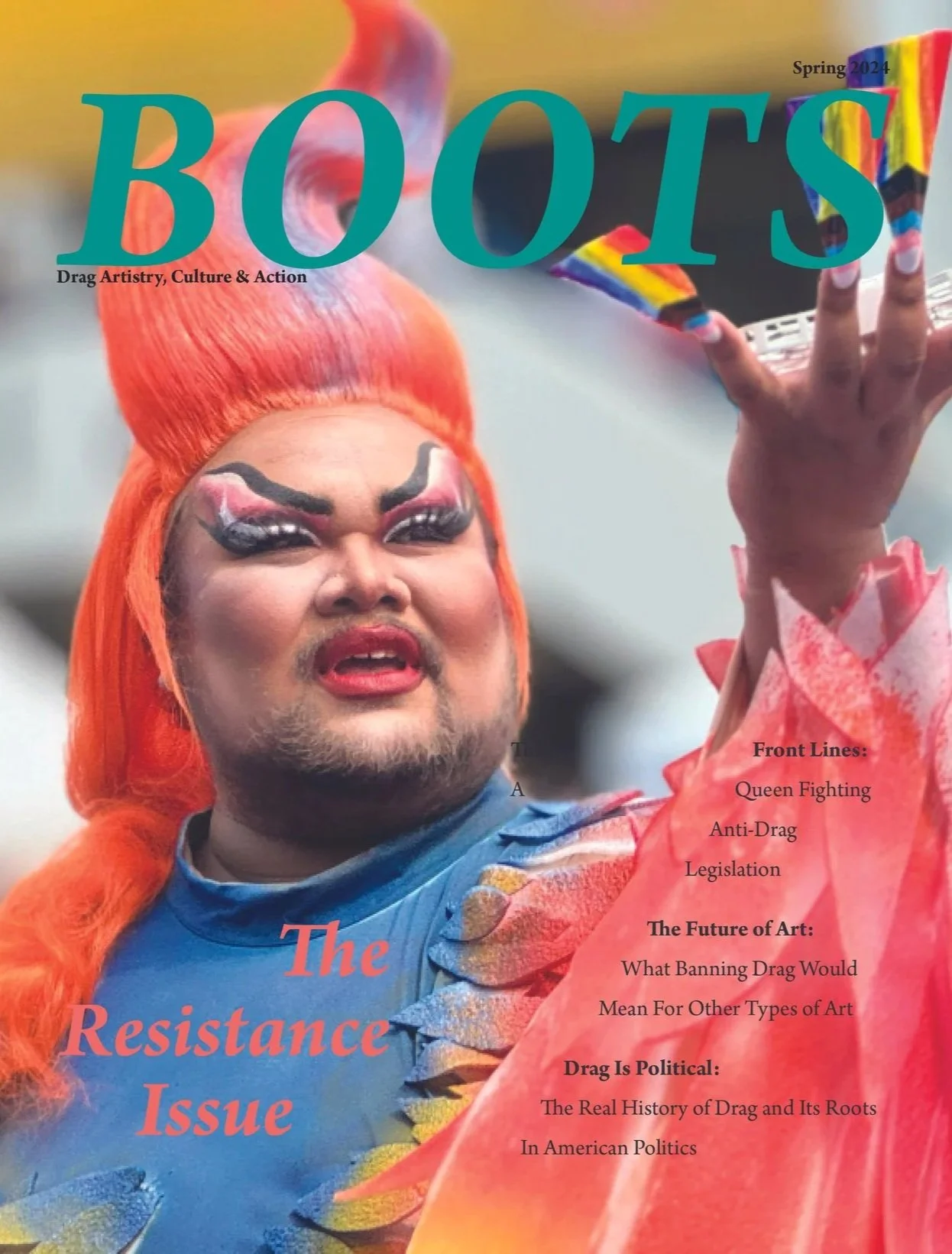
These first cover iterations were part of the design process. They featured cluttered typography, blurry background imagery, and disconnected visual elements that ultimately made the design feel overwhelming. Recognizing what wasn’t working helped me refine the concept, establish a clearer visual hierarchy, and create a cover that better reflected the bold and intentional identity of Boots Magazine.
Now we explore.
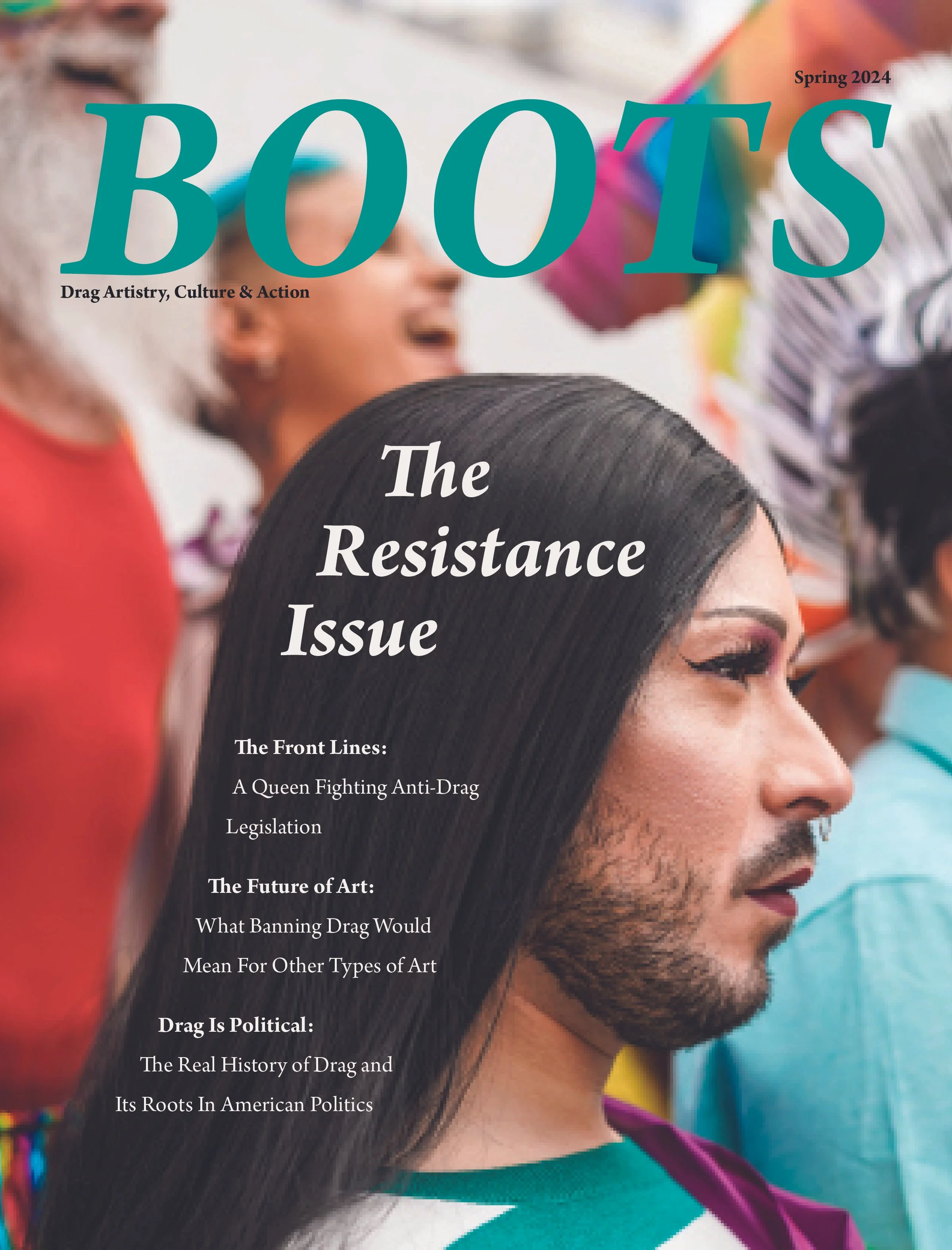
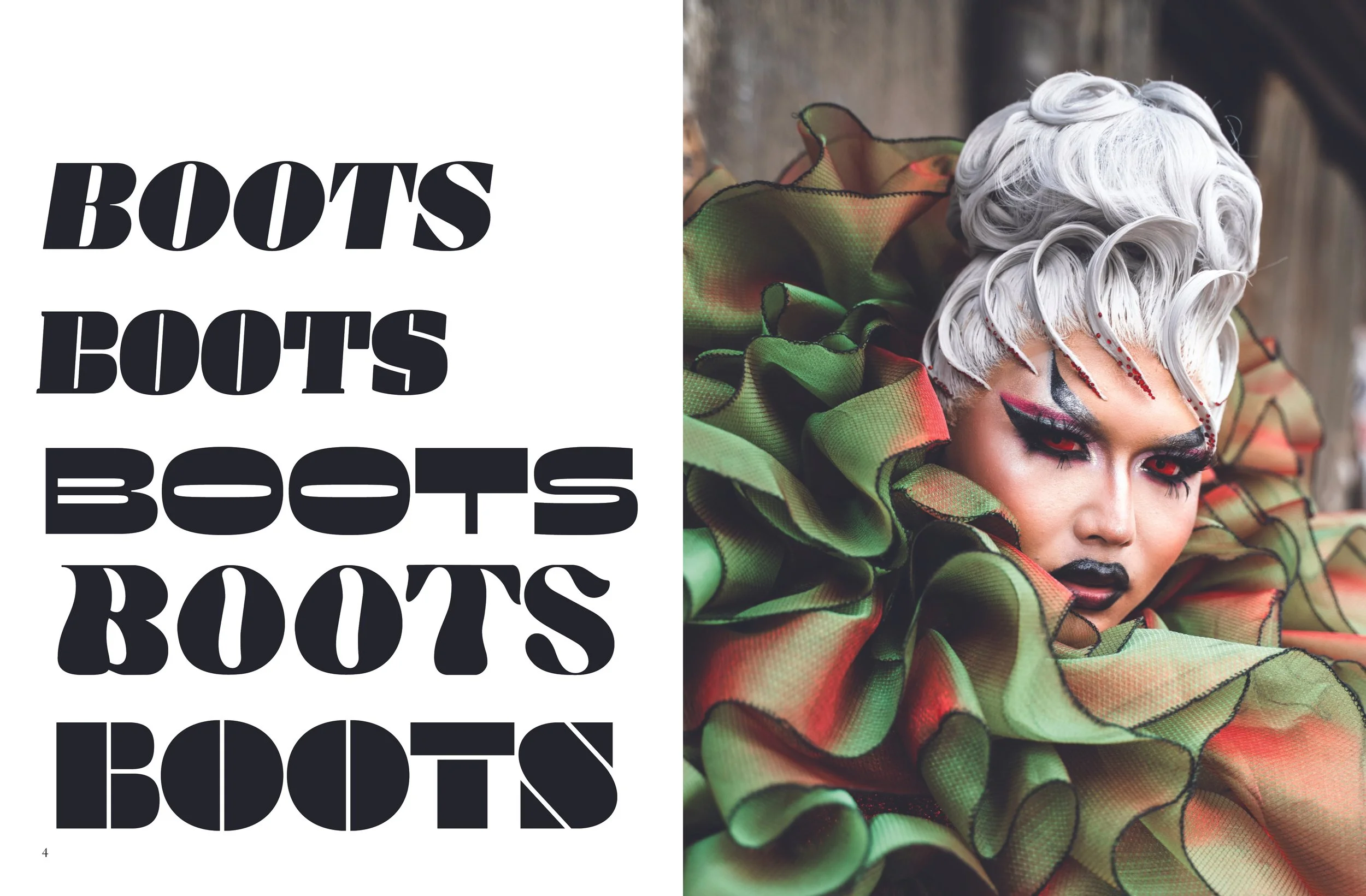
I experimented with a variety of typefaces to find a masthead that captured the bold, rebellious spirit of drag while still feeling polished and editorial. I also shifted toward more editorial-style imagery to put the artistry of drag front and center. Laying out different combinations of fonts, images, and compositions became a valuable exercise in exploring the possibilities and defining the visual direction for the final cover.
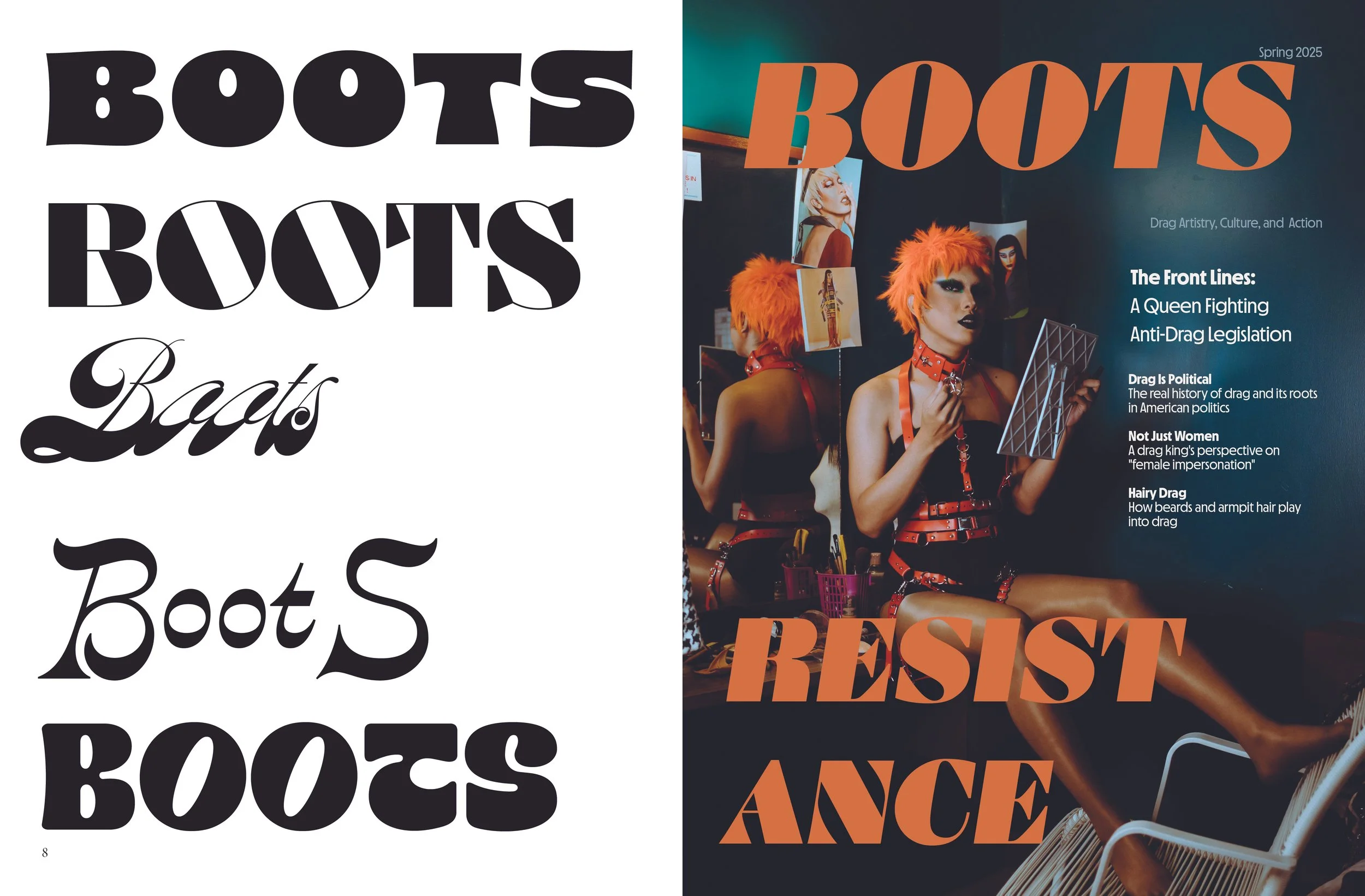
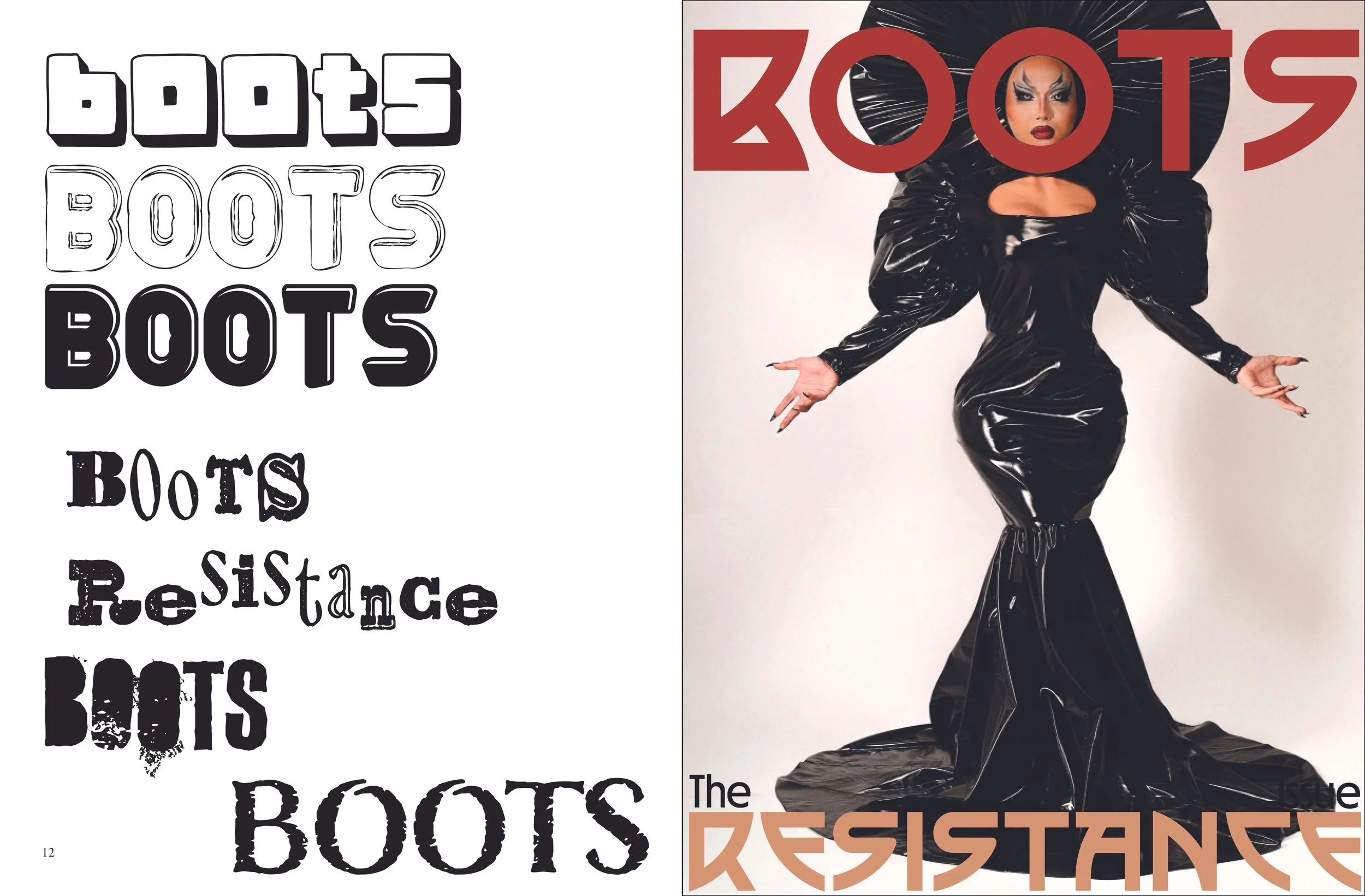
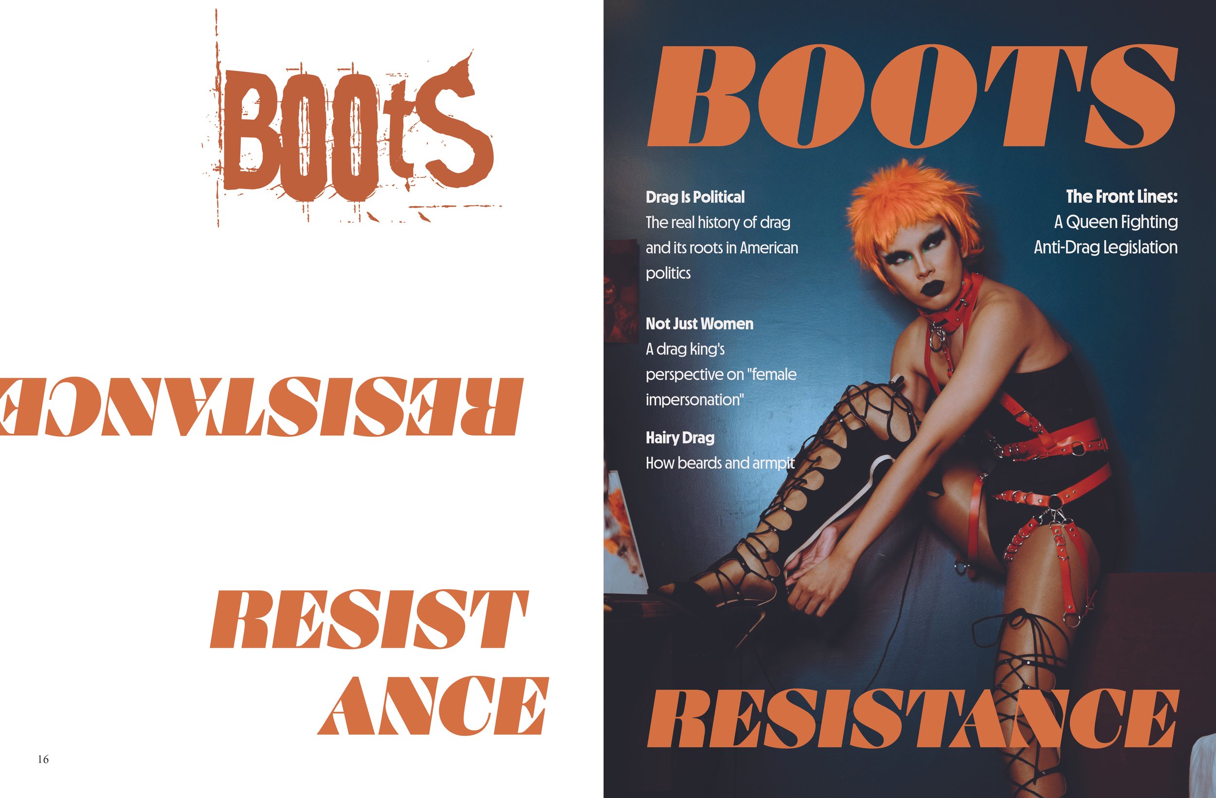
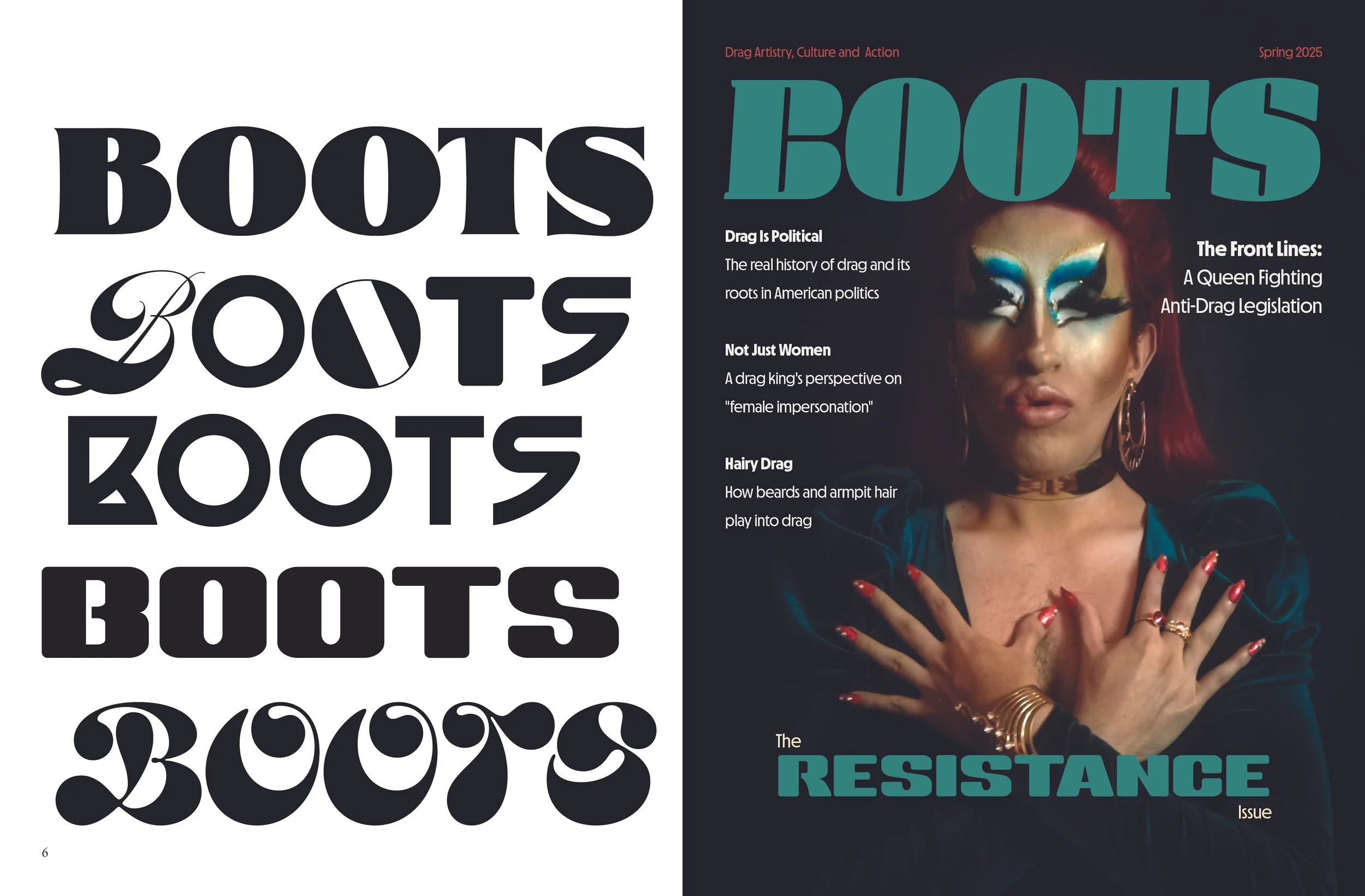
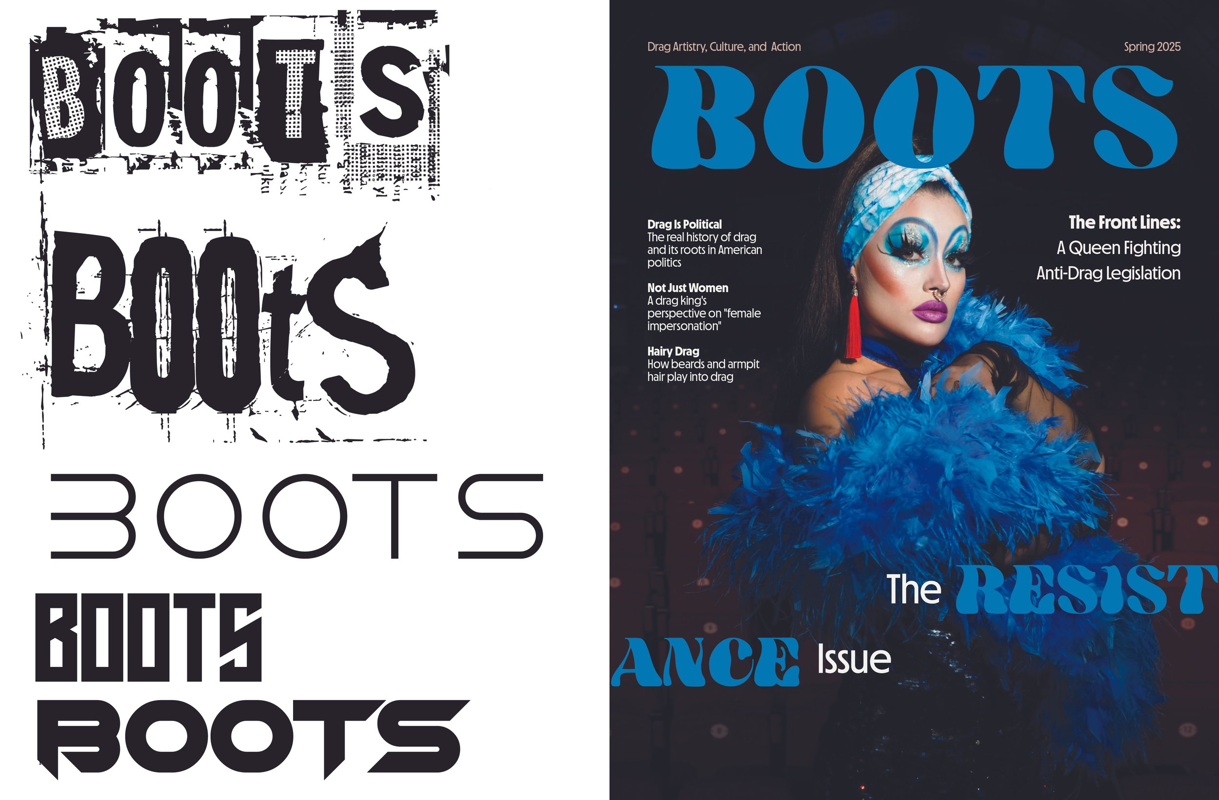
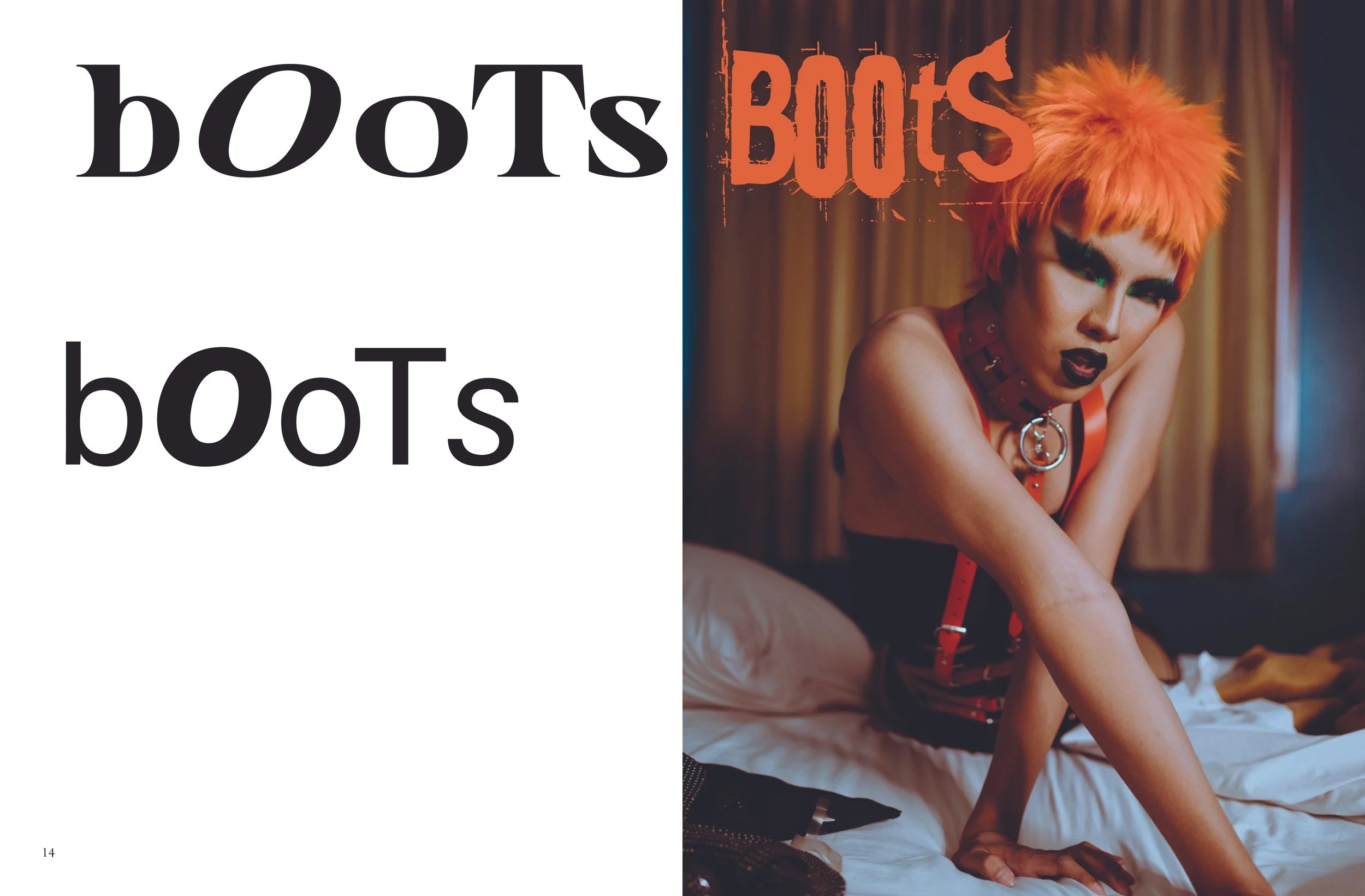
I settled on the image to the left because I loved the model’s intense expression and the vivid combination of teal and orange. The contrast felt energetic and dramatic, while still giving the cover a strong editorial feel. I had fun pushing the typography beyond a traditional editorial layout—playing with upside-down text, breaking up RESISTANCE, and incorporating a queen’s face into one of the O’s in BOOTS.
For the final cover, I chose Manometer Serif High Oblique for its bold, expressive character and pulled the supporting colors directly from the imagery to create a cohesive, high-impact design.